Monday 1 July 2013

Digital Imaging: Assignment 3

For this assignment it is about designing a poster by using half of your photos and half from the internet. 
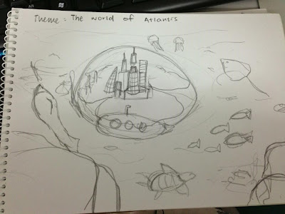
The theme that I have chosen is The World of Atlantis. The reason that I have chosen this is because I love fantasy like discovering a new world.
 So,
This is my sketch.

And these are the 5 pictures taken by me


And these are the 3 photos taken from internet


Process & Techniques: 


1. Combine two photos together and clean the city nicely by using eraser + a layer of masking.


2. After cleaning, I have re-size it within the circle by pressing ctrl T.  
Then, a rock has been inserted at the bottom left of the background. 
Match color is used in both city and rock.
To make the rock more realistic, I have added some effects by using: 
Layer style > Bevel and Emboss, Inner shadow.
Reason of using Bevel and Emboss is to add shadow and making 3D effect. 
As for the Inner shadow it is use to stimulate 3D depth in a 2D image.
For Bevel and Emboss I have adjust the Structure to = Depth: 123, Size 125, Soften 12  
Shading = Angle & Altitude 30', Highlight mode: Overlay, both of the opacity is 75%. 
For inner shadow I have adjust the Structure to = Blend Mode: Color Doge, Distance: 16 px, Choke: 0, Size: 14 px.

3. Time for creating the Globe. I have open a new square file and fill the background with sky blue. 
Then use ellipse tool and drag the globe out by pressing SHIFT key to make a perfect circle. 
Gradient tool is used and adjust more blue color on it. Then fill it within the circle by dragging a diagonal line.  
Go to filter > noise > add noise > 6%. 


4. The globe is added in to it and erase the bottom part. 
Re-size it accordingly then change the opacity to 40%.
Notice that the color of the sea is different. I have create a new layer (illumination) and fill it with black. Then I have use eraser and adjust the size to the biggest and the hardness to highest and erase out the sun path. Touch up a little by using 50% of opacity and reverse back the sides to make it natural.  
Furthermore, I have added Filter > Render > Clouds to create the texture of the sea. 
Another side of the rocks is added.


5. The tone of right rocks is adjust like the left side. 
The animals is added and transform tool is used to flip the dolphin. The color tone is adjust as the same as the rocks as well. (Layer style + Match color)


6. A layer of shadow of city is added by using the ellipse tool to draw a ellipse shape. Choose black color as the foreground color and adjust it accordingly. Then go to filter> Blur > Gaussian blur and choose 13 px. Filter > Blur> Motion Blur and choose 11' anlge, 165 px. 
The font is placed on top right corner. 

After checking..... need improvement on the globe, fonts and placing, add more details.

So I have make another globe. 
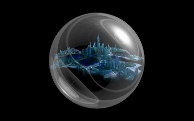

7. Open a new file 1000 x 1000 px. Fill in the background color with black. 
Then I have go to filter > render > lens flare with brightness: 75%, lens type: 50-300mm zoom.
Edit> transform > Flip Vertical.
Go to Polar coordinates then click on rectangular polar and the globe is made.
Elliptical marquee tool is selected and draw on the globe. 
then go to selection> save selection > name globe. A new layer of globe is created.
Click on a new layer, fill with black. 
Go to channel > select everyrhing Ctrl A
then another new later fill with white. Press Ctrl + D and automatically the snow globe is in white now. To make it more white, press again and adjust till the amount of white I want.
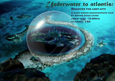


8. The globe is replace to the new one. 
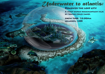


9. The shape and the tone of the color is being experimented using ctrl T and match color respectively.  
Coral is added on the left side of the rock. Match color, burn tool and stamping tool is used to copy and paste around it to make it realistic.


10. I wanted to create golden words at first but it is insert to the picture the colors is gone so...


11. I have use Trajon Pro for the text and place it over the bottom right. I have touch up by using black paint on every part of the poster. The final touch is creating the shadow at the globe 

AND... IT'S DONE! MY OWN ATLANTIS DOCUMENTARY POSTER. 

These are all the techniques I have learn :) hope you everyone enjoy looking at it


Saturday 22 June 2013

Digital Imaging: Assignment 2

Create a Text Portrait of the person you admire.

I love Hayao Miyazaki's work very much that's why I chose him. His work is so inspirational and always full of colors that's why i choose colors of rainbow for him. 

Steps and Techniques: 
1. First I have extract the background by erasing it and put it on the white background
2. Then I have go to Select > Color Range > Shadows. Copy the shadow into a new layer by pressing Ctrl C + Ctrl J
3. Again select the original background go to Select > Color Range > midtones. then make it into another new layer by pressing  Ctrl C+ Ctrl J again. 
4. Select Midtone layer and go to Edit > Fill > 50% grey
5. Select Shadow layer and go to Edit > Fill > black
6. Merge the 2 new layers
7. Create a new file and write down all stuff about Hayao Miyazaki. 
8 Use a rectangular Marquee tool and go to Edit > define Brush Preset and name it
9. create 2 new Layers and select one of it. Click on it and press ctrl + backspace to fill it with white.
10. press the second layer then choose the brush that just created from the brush menu on the brush tool.
11. Increase the brush size and print it on the portrait. 
12. Select the background layer ( midtones+ Shadow) and press Ctrl A to select all and Ctrl C to copy all.
13. Press the text layer and add a new layer on it.
14. Then press alt and click on it so that it will be white
15. Then press Ctrl V to paste and Ctrl D to deselect. 
16. Invert it by pressing Ctrl I.
17. Now I'm going to add the effects by pressing add a layer style > Gradient > Colorful Gradient.
18 Change the Text to Screen.
19. Then choose brush tool and change opacity to 30% and render the portrait.
20. the colors will become nicer and the eyes and face will become more visible.
21. Open a new background again and type out the words 
22. Then again use a rectangular Marquee tool and go to Edit > define Brush Preset and name it.
23. Choose the text on the brush menu and adjust the size and print the text on the portraits. 
24. Duplicate the portrait and flip to the right side. 
25. Change the colour by pressing add a layer style > Gradient > Colorful Gradient.
26. Change the Text to Screen.
27. Touch up a little and Text portrait of Hayao Miyazaki is done!

reference on youtube text portrait

Digital Imaging: Assignment 1

So what's DI? In short it is learning how to use photoshop. 
In this class I have learn the basics of using it and I'm going to post the techniques I have learn so far.
 

Week 1: Putting a person into different background. 


This assignment is an introduction to how to use photoshop. The person in the middle is not as real as how it is now until I have learn other technique and applied on it.
So, the techniques I have learn for week 1 is: 
1. Using marquee tool  on thing that i want to cut out which is me 
   - Cut & paste [command c then command v] 
2. Paste on the background and cleaning it with brush by adding masking 
   (this tool can revive the part u erase off back to screen again!)
3. Duplicate  the layer twice to make shadows on the floor and the water. 
4. Set the contrast of the shadow to make it black. 
5. Lastly use match color to make it real. (technique of week 4)

Week 2: All about cloning using stamping tool 


How do u make one into 2? or even 100? by using stamping tool everything is possible. 
Technique: 
Firstly, I have flip the image first. Then use stamping tool  and pressing alt key and click on the nose of the squirrel and stamp it on the other side. 


This is about how to cover words that you don't want it to be shown. 
It's the same method. 
Technique: 
Use stamping tool and stamp on a part which doesn't have words, then stamp on the surface with words. By doing this you will cover that place up. Then I have stamp the details of the brown water stain on the surface to make it look real.


This is the hardest among all. :( It's about perspective! You can choose to duplicate it by using stamping tool or cut and paste on the vanishing point. 
Techniques: 
1. Click on vanishing point  and use create plane tool to point the area that you want to copy. 
2. The blue color lines will come out and adjust the perspective of the plane. 
3. Drag the plane almost the end. 
4. Press command c then v and drag to the back of the train. 
3. Same method for the third train.         


Week 3: Girl on fire


Everything is possible using photoshop; even the hair is on fire. 
This is something similar with week 1 - copy the fire and put it on the girl's hair.
Techniques: 
1. copy the fire and put on girl. duplicate  as much of fire you want in order to cover the original hair and arrange it accordingly.
2. You can either use magic wand tool  to crop the girl's hair or select color range and select the blue background and it will automatically crop the whole body out.
3. use the lasso tool and cut out the remaining part which is the body and face. 
4. The fire will be automatically shown on the hair only. Select each hair and make it to screen and it will curve nicely on the hair. 
5. To make it more realistic, I have use Gaussian blur to make the fire blend in more. 


Week 4: Houses in different backgrounds


Haunted house! haha. Similar to week one too but this is the match color technique to make it more realistic! 
techniques: 1. After copied  the house, Match color is used and choose the background as the color I want to match and adjust the color. and Tada! The color of the haunted house is just nice.
2. Copy the bride and change the opactiy to make it looks like ghost.
3. Next gradient tool is use to make the light.


The second house: Fantasy house
This technique that I have used was cut and paste and clean the sides with brush. And the last thing is match color again. The color of the house is brighten up. 


 The third house: Sunset 
Same thing again and I have copy the house on the island. Then I have duplicate the house and trees to make the shadow. Change the opacity of the shadows and use filter(ocean ripple) to make it more realistic.

Week 5: Tracing


This Assignment is quite challenging in how you control your mouse and it is time consuming! If you have a tablet, there is not much of problem. 
Techniques: 1. Freeform Pen tool is used for all the lines and the colored shape. Trace every single thing. 
2. Then the background is made by using rectangle tool and duplicate it in to 16 yellow and white strips. Like candy bars.
3. I have choose filter > distort > polar coordinates and the strips will be pointing on the middle. 
4.Again i have choose filter> filter gallery> mosaic tiles for adding the texture one the background. 
5. The cheek is additionally made by using circle tool and adding gaussian blur to blend on the skin. 


Create your own texture paper! It's all about Filters!
Techniques: 1. Paint the white background with red. 
2. Go to filter> Pixelate> Mezzotint. then u will get the dots form
3. Then go to filter again > Distort > twirl
4. again Filter> Pixelate > Lens flare (to get the shining effect on the middle)
5. Lastly use the burn tool to get the black color dots around the corner.


Week 6: Displacement


This assignment is about making something flat on something curving. 
Techniques: 1. choose displacement of the flag in displacing the cloth
2. Save the displaced flag and copy the original flag on the cloth
3. then displace original flag using the flag that have displaced


Now is the snake man. Similar as the flag.
Techniques: 1. Displace the snake skin and then place on the face of the man
2. Erase the extra parts and adjust the opacity to make it realistic
3. I have colored the eyes and lips just for fun and make it nicer. 


Week 7: Tracing with Words


This technique is tracing the face with words and create a background to put underneath the words. 
Technique: 1. Type the the word and rasterize type. 
2. Then go to Edit> transform> Warp 
3. adjust it to make it curvy. 
4. Repeat these steps of all the words! this is how I do it haha

From Week 8 - 10 do whatever I want to


Week 8: Free topic


Techniques: 1. I have use the gradient tool to create the rainbow
2. Then the rainbow is duplicated to create the reflection on the sea. 
3. A couple is paste in and make it in to silhouettes by adjusting the hue.
4. match color is used for the rainbow


Week 9: Free topic


Techniques: 1. I have hybrid the chick and then cat together by using cut and paste. 
2. Match color is used for the color tone of the cat and chick.
3. Burn tool is used to blend the neck and the cats fur to make the same tone. 
4. the cat i placed in 3 different pictures.
5. the words is being replace


Week 10: Free topic


Techniques: 1. Lasso tool is use to crop out the hands, head, legs and stomach
2. different of water forms is been put on it and the color has been adjust to black and white.
3. the water is being place and adjust to make it fitted.
4. the water on the stomach is overlapped by different forms to make it realistic
5. The background is made by using gradient tool and Filter> Texture> Craquelure
 .


That's about it. My First Assignments of photoshop photos! :)


Wednesday 6 February 2013

The End Has Come

credits to Ryan Lee
APRIL INTAKE 2012 FOUNDATION IN DESIGN

Finally, the sem has end! I'm happy :DD: but sad as well. Happy that finally there is a break but sad that we have to be apart and no longer in the same class. But if there is no separation, then we wouldn't appreciate that much anymore. 


I truly learn a lot and maybe grow a little through this foundation :) These happy memories will stay in my heart forever. Wish everyone all the best in future and have a great time in anything you do! 

Oh yeah a quote that i think is really meaningful and it is the major thing that we should learn through this sem, 
"Nothing can stop an idea whose time has come," Victor Hugo. 
We must believe in ourselves :)


Hope to see you guys soon :')

In Regards, 
Shereene :] 

CS Final Project: Documentary


 link for the pic
This is our last group project for contextual studies. I am honored to join the group of G.L.Y.S. :) This is a good experience for us to meet and know more about the world outside. As usual we have research the way of documentary.

There are mainly 6 ways of doing documentary.

1. Poetic documentaries, which first appeared in the 1920’s, were a sort of reaction against both the content and the rapidly crystallizing grammar of the early fiction film. The poetic mode moved away from continuity editing and instead organized images of the material world by means of associations and patterns, both in terms of time and space. Well-rounded characters—’life-like people’—were absent; instead, people appeared in these films as entities, just like any other, that are found in the material world. The films were fragmentary, impressionistic, lyrical. Their disruption of the coherence of time and space—a coherence favored by the fiction films of the day—can also be seen as an element of the modernist counter-model of cinematic narrative.

2. Expository documentaries speak directly to the viewer , often in the form of an authoritative commentary employing voice over or titles, proposing a strong argument and point of view . These films are rhetorical, and try to persuade the viewer. (They may use a rich and sonorous male voice.) The (voice-of-God) commentary often sounds ‘objective’ and omniscient. Images are often not paramount; they exist to advance the argument. The rhetoric insistently presses upon us to read the images in a certain fashion. Historical documentaries in this mode deliver an unproblematic and ‘objective’ account and interpretation of past events.


3. Observational documentaries attempt to simply and spontaneously observe lived life with a minimum of intervention. Filmmakers who worked in this sub-genre often saw the poetic mode as too abstract and the expository mode as too didactic. The first observational docs date back to the 1960’s; the technological developments which made them possible include mobile lighweight cameras and portable sound recording equipment for synchronized sound. Often, this mode of film eschewed voice-over commentary, post-synchronized dialogue and music, or re-enactments. The films aimed for immediacy, intimacy, and revelation of individual human character in ordinary life situations.

4. Participatory documentaries believe that it is impossible for the act of film making to not influence or alter the events being filmed. What these films do is emulate the approach of the anthropologist: participant-observation. Not only is the filmmaker part of the film, we also get a sense of how situations in the film are affected or altered by her presenceThe filmmaker steps out from behind the cloak of voice-over commentary, steps away from poetic meditation, steps down from a fly-on-the-wall perch, and becomes a social actor (almost) like any other. (Almost like any other because the filmmaker retains the camera, and with it, a certain degree of potential power and control over events.)” The encounter between filmmaker and subject becomes a critical element of the film. 

5. Reflexive documentaries don’t see themselves as a transparent window on the world; instead they draw attention to their own constructiveness, and the fact that they are representations. How does the world get represented by documentary films? This question is central to this sub-genre of films. They prompt us to “question the authenticity of documentary in general.” It is the most self-conscious of all the modes, and is highly skeptical of ‘realism.’ It may use Brechtian alienation strategies to jar us, in order to ‘defamiliarize’ what we are seeing and how we are seeing it.

6. Performative documentaries  stress subjective experience and emotional response to the world. They are strongly personal, unconventional, perhaps poetic and/or experimental, and might include hypothetical enactments of events designed to make us experience what it might be like for us to possess a certain specific perspective on the world that is not our own, e.g. that of black, gay men in Marlon Riggs’s Tongues Untied (1989) or Jenny Livingston’s Paris Is Burning (1991). This sub-genre might also lend itself to certain groups (e.g. women, ethnic minorities, gays and lesbians, etc) to ‘speak about themselves.’ Often, a battery of techniques, many borrowed from fiction or avant-garde films, are used.

Reference for the text press HERE

After the long research we have done and watch many of the documentaries, which gave us a direction on how to deal with the style.

We are often scared of watching documentaries. Why? Once the word documentary come across our mind, our brain will automatically send us a message which is - boring, very boring and SUPER BORING......


 ENOUGH FOR DOCUMENTARIES . (Link for the pic)
In order to make it more interesting, we have used free style which is like a combination of observational documentary & performative documentary to film our own documentary. :) Something like traveling style of interviewing will be great. At first the scenery will catch the attention of audience and also it will give an enjoyment feeling. 

something like this :)

Then, we have started to search for our targets ( people who have their personal style in their work). Lucky enough for us, we have found  Mr. Chok Yen Hao an Mr. Yap Kim Boon.

PROFILE 1:

Name: Chok Yen Hao  
Age: 40
 Job: Domestic Tourist & Photographer
Aim / Dream: Introduce many beautiful places at Malaysia to all  Malaysians and also the foreigners.
Characteristics: Strong Curiosity, Loves to Travel especially (places he doesn't know the language), Helpful, Loves nature and his country;Malaysia. 


PROFILE 2: 

Name: Yap Kim Boon
Age: Unknown
Job: Artist
Aim: What I want to capture in each of my paintings is the expression of nature, in terms of both beauty and its importance to mankind as a whole. Nature is God 's gift to us, and if my art can somehow get that message across, so much the better.
Characteristics: Wise Man, Loves to paint, Loves nature, Discover new themes in unknown places, Dare to explore and take risk, Humble and always thankful.

Pictures of Mr. Chok's works: 

Beach of Kemasik, Terengganu
Paddy Fields of North Malaysia 


Scenery of  Old streets at Terrengganu
Waterfall 


Beautiful Clouds at North Malaysia
Malay Kampung


Tree
Paddy Field


Mountains
 Pictures while interviewing with Mr. Yap:
Numerous of PAINTSSS


Beautiful Gallery View 1
Beautiful Gallery View 2


Mr. Yap's Painting 1
Mr. Yap's Painting 2


When we first met them, we were nervous yet excited. Things that we learn from them were never ending. As we were interviewing them, they talked about their life experienced and the job they were enjoying doing now. Both of them have something similar, which is they love nature very much. They are very kind to help us in many ways. Through this shooting we wanted to let the audience to know there are people are doing such meaningful jobs. Also the style of both of them are the same as well which is being free. They don't like to be restricted like what is the social world right now. And now, they have successfully break the chain of restriction. They can express freely how they feel through their work. Inspiration of their work are from everywhere. As long as you discover it with passion. 

Although their appearance are getting old, but their mind and soul are still young and full of spirit.
We know that success doesn't come easy unless you strive for it. 

HERE COMES THE TRAILER :)


AND NOW THE DOCUMENTARY OF TWO MEN, ONE DREAM!


Our Interview ends with a picture :) 


More info for Mr. Chok Yen Hao Click HERE to his Facebook Page. 


More info for Mr. Yap Kim Boon click HERE to his homepage.