Wednesday, 6 February 2013

Final 2D Design Project: Texture Project

For this assignment we have to work in groups and design a 2D pattern and put on a 3D form.
Our group members are:
1. Eva Lim 2. Kate Soe 3. Yow Jia Xin 4. Ryan Lee and 5. Me.

This work is inspired by one of the artist that we have interviewed, which is         Mr. Yap Kim Boon. 

The way that he appreciates nature really inspired and touched us. One of his painting was a scenery painting of KL. This painting was inspired when he was in a restaurant that is surrounded with nature. He enjoyed the view of KL city very much but he was sad that nature has to be sacrificed.

At first, we have discussed on what theme and what tool to use. We have explored and experimented a lot of the elements. So we have decided on Contradiction of Human Life.


As we all know that at this new generation, the beautiful scenery and advanced architects is what we humans are proud of.


But the price of human made beauty is by destroying nature. We wanted this lamp to raise the awareness of humans to appreciate nature more and do not take it for granted.


For the 2D patterns we have used natural and recycled materials:
  • vegetables: bitter guard, stem of leaves
  • sticks
  • toothpicks
  • paint
  • fluffy strings
  • paper

We have used these materials to create many shapes. Then, we have came out with 4 designs and combined it to make it a lamp. Why lamp? Because the effect of lights are really eye catching while you present it.
Finally this is our product! 


I will talk about the first side of the design which is the illusion. It represents human thinks that everything is going to be fine. But we don't know that actually problem has occurred. It is the same when you look at the lamp far away, you will not notice that the grids are not in the same size. As you are near to it only you can see the differences.

Next is the buildings. There are day and night view of the city. It shows the beauty of the city view that are made by human. For the background of both city views, it was covered with the 2D elements that was painted with black paint. The elements were sun, clouds and haze. It represents the effects of the nature being destroyed. Only when day time you can see it clearly. When it is dark and the lights are on, you will enjoy the view. These are the contradictions.

How can we make a balance between nature and the rise of technologies? 
We should take the responsible before it's too late.    

Oh WAIT! Forgotten the essence of the design, which is the
  Gestalt Principle 
We have use most of the principles which involved: 
-similarity, continuation, figure and ground and alignment. 

For the illusion part we have used all the principles. These principles definitely can lead the viewers to have the illusion effect. 

For the city view we have used similarity on the buildings. Figure and ground we have applied on the windows. For the clouds, sun and sunlight we have used continuation. 


And that's the end about it. :) I hope you have enjoyed our production as we have put a lot of effort on it! Thanks (:

Tuesday, 22 January 2013

CS: Knowledge of Batik

Batik is one of our hand craft product which Malaysian are proud of. Today, Malaysian batik can be found on the east coast of Malaysia such as Kelantan, Terengganu and Pahang. The elements of design for the batik is mostly flora but not fauna. It is because islam norms are forbidden to use them. 

There are many country holds this tradition too. Javanese is the most notable and rooted of their traditional batik. It all started when the Sumatrans and Javanese have moved to Malaysia.


There are some examples of the batik in Malaysia:


Notice that all of them are only Fauna

While I have arrived there I was very exciting. I quickly look around and took some photos. Later there was  a worker explaining how to make a batik. After the explanation we can start to do our batik freely. 

This is the board of making the batik and the original batik. 
 Quincy and Eva :)


Me, Karen Jing Er and Janice :) 


Wax and Tools 


Colors for batik

Working working working


Production of my Friends


Artwork from the batik centre


And this is my PRODUCT! :)

Title: Dancing Tulips

The elements that I have used on my batik are tulips, tendrils, leaves and sun. I have the idea of making stained glass technique on the batik. I wanted to let the viewer to have a positive and happy feeling while looking at my work. So I have use the purple color for the tulips. For the stem, tendrils and leaves are in green color. For the color of the background is orange. Orange color can elevate moods too. I have drawn some polka dots around the background which is the sun.
Tulips are originated centuries ago in Turkey, where it played a significant role in the art and culture of the time. The Turks cultivated them in flower beds and window boxes and they used the flowers as patterns on textiles and rugs, ceramic tiles, buildings and fountains and even, especially in the case of women, on tombstones. Their name for the tulip was lale, but another Turkish word, dulband, or "turban," is the origin of our English name, presumably because of the flower's shape. As Europeans began taking to tulips, the flower's popularity spread quickly, particularly in the Netherlands where a phenomenon dubbed tulip mania set in at one point during the 17th century. It soon gained major popularity as a trading product, especially in Holland. Tulips became so highly-prized that prices were sent soaring, causing markets to crash. Different varieties do grow wild in North Africa and from Greece and Turkey all the way to Afghanistan and Kashmir. Very occasionally they are even found in southern France and Italy, usually in vineyards or on cultivated land, which has led some botanists to speculate that they may have been brought back by the Crusaders. Tulips are now grown throughout the world, but people still identify cultivated varieties as "Dutch tulips. The meaning of tulips is generally perfect love. Like many flowers, different colors of tulips also often carry their own significance. For purple it symbolizes royalty. The tulipan “have little or no smell, but are admired for their beauty and variety of color."
Orange combines the energy of red and the happiness of yellow. It is associated with joy, sunshine, and the tropics. Orange represents enthusiasm, fascination, happiness, creativity, determination, attraction, success, encouragement, and stimulation. To the human eye, orange is a very hot color, so it gives the sensation of heat. Nevertheless, orange is not as aggressive as red. 

It was really fun and I'm glad that i have made my own batik. It makes me know more about our own country. That's about it! thanks! :)

2D Design: Silhouette

This assignment is kind of special as we have to watch movie to observe what is silhouette and get some inspiration from the movie. The movie i have chose to watch is James Bond 007: Skyfall.


Some of the scenes of silhouette from this movie.


All pictures are from Google.
It is a really nice movie to watch and it has lots of silhouettes. It really attracts my vision and it is a spark as well throughout the movie. 

So What's Silhouette in simplified version? Black & White Pictures
In a deeper version is: 
When we turn our subjects into silhouettes, we are abstracting them – often showing less and saying more in the process. We can use those silhouettes to create symbols and metaphors that provoke the imagination and thoughts of our viewers, creating meaning and telling stories. 
For more info press here.

Here are some other examples of silhouette:

Silhouette in Story. 
Silhouette in nature. 
Silhouette in Art Work
Now I understand that silhouette is an art without showing emotion. But through action you can see feel the emotion. 

And now this is my work.            


For those who don't understand I will explain in text. :) I have written a story of a girl. She woke up in the morning and walk from her house to city. She passed by many roads and look around. She used the same route everyday and bought a bouquet of flowers. When she passed by a couple sitting on the bench she started to think about his ex-boyfriend. She thinks of many happy memories while hanging out with him. She started to break down when she thinks of the day she went out with him to the ferris wheel. Finally she arrived to her destination which is the lovely meadows graveyard. She touches her boyfriend's grave and kneel and cried. the background of last scene is similar to the first scene. I have leave the death of her boyfriend as an mystery.. It's up to you to interpret! :)


BUT SADLY IT FAILED. (MY WORK) that was a great story. 
HAIH. SAD CASE
  In the end i have to redo because my last minute work sucks. :[  
AND again this is my SECOND PRODUCTION.
See it in U turn shape form


AND GUESS WHAT? 


PASS FOR SURE :) haha


MY Title for this work is : THIS IS LIFE
Why would i say this? 
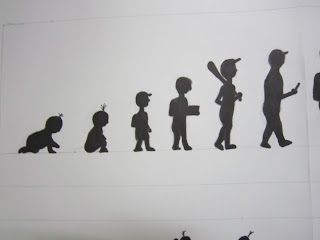
If we see life in a fast forward way, the normal routine of a human's life is like this. 
From birth -> childhood -> teenage -> adulthood -> have a family -> old age -> sick -> death
It's a cycle of human life.
But i know Life is more than this! We can do more and make our life fill with more colors. To live a life with no regrets. :) 
This piece of work is inspired from the main essence of silhouette, which is simplified but with emotions inside! 

That's about it and see you again :D

2D Design: Tessellation

When Mr. Charles have assign this work to us, I have no idea of what is this all about. When i discover more i found out this tessellation thing is cool yet hard! I know my dooms day is near. But don't worry, i will take it as a challenge! :) 


Base on my research, i have found out that M.C Escher is the one who is real professional in doing tessellation. Tessellation is the process of creating a two-dimensional plane using the repetition of a geometric shape with no overlaps and no gaps. It is usually seen throughout art history, from ancient to modern architecture.


The word 'tessera' in latin means a small stone cube. They were used to make up 'tessellata' - the mosaic pictures forming floors and tilings in Roman buildings. (picture below)


Nowadays, the term "tessellation" has become more specialized. Its meaning has changed. Now it means pictures or tiles that aren't just square-shaped. Usually, particularly in Esch-style tessellations, the tiles aren't square. The individual tiles are the shape of animals, people, and things. Nowadays, when we say "this is an animal tessellation", we don't see lots of little tiles making a big picture of an animal. Instead, each little tile is a little picture of an animal. (Like the tessellation below)


Reference for text and all pics: http://www.tessellations.org/tess-what.shtml

Without any further delay I will introduced my work based on 6 Gestalt Principle. 
The first one is: 

Example: 

1) Figure and Ground
Motif: Car


Bump to Bump.
This is the top view of the car. 

2) Closure. 
Motif: Television 


World of Tv
The Televisions are connected to each other as it makes a closure effect.

3) Proximity 
Motif: Wheel


Wheel in wheel.
It starts from a small wheel round wheel and it expands. There are rectangle wheel inside a big wheel too. 

4) Similarity
Motif: Tasty


There are 2 ice-cream complementing each other. One  of the color is pink ice-cream with black cone and vice versa for another one. Although both of the ice-creams have different colors but both are same due to the same shape. 


5) Continuity
Motif: Funneling


Time is precious

The whole drawing is showing the continuity of the time flowing. From the top of the sand clock it is the start and as it goes downward it started to be lesser. Till the end the time has passed.

6) Alignment 
Motif: Buffalo


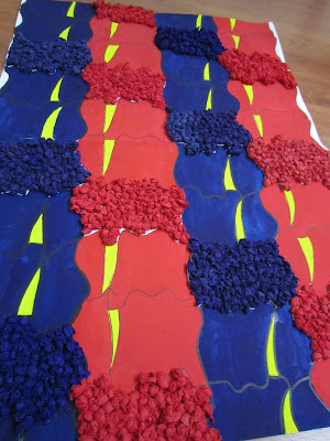
Fights of Red and Blue

I have use colors to lead the viewer's eyes in vertical form. In another way i have use different materials make a pop up visual form. It will eventually leads viewer to look slant.  

A more complete version

Nearer View
I have enjoyed using all kinds of element to create a tessellation. But compare to MC. Escher's work my work is nothing. But i'm still happy with the finishing work. :) That's for all!