Base on my research, i have found out that M.C Escher is the one who is real professional in doing tessellation. Tessellation is the process of creating a two-dimensional plane using the repetition of a geometric shape with no overlaps and no gaps. It is usually seen throughout art history, from ancient to modern architecture.
The word 'tessera' in latin means a small stone cube. They were used to make up 'tessellata' - the mosaic pictures forming floors and tilings in Roman buildings. (picture below)
Nowadays, the term "tessellation" has become more specialized. Its meaning has changed. Now it means pictures or tiles that aren't just square-shaped. Usually, particularly in Esch-style tessellations, the tiles aren't square. The individual tiles are the shape of animals, people, and things. Nowadays, when we say "this is an animal tessellation", we don't see lots of little tiles making a big picture of an animal. Instead, each little tile is a little picture of an animal. (Like the tessellation below)
Reference for text and all pics: http://www.tessellations.org/tess-what.shtml
Without any further delay I will introduced my work based on 6 Gestalt Principle.
The first one is:
Example:
1) Figure and Ground
Motif: Car
Bump to Bump.
This is the top view of the car.
2) Closure.
Motif: Television
World of Tv
The Televisions are connected to each other as it makes a closure effect.
3) Proximity
Motif: Wheel
Wheel in wheel.
It starts from a small wheel round wheel and it expands. There are rectangle wheel inside a big wheel too.
4) Similarity
Motif: Tasty
There are 2 ice-cream complementing each other. One of the color is pink ice-cream with black cone and vice versa for another one. Although both of the ice-creams have different colors but both are same due to the same shape.
5) Continuity
Motif: Funneling
Time is precious
The whole drawing is showing the continuity of the time flowing. From the top of the sand clock it is the start and as it goes downward it started to be lesser. Till the end the time has passed.
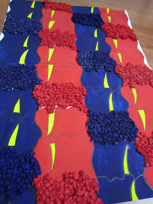
6) Alignment
Motif: Buffalo
Fights of Red and Blue
I have use colors to lead the viewer's eyes in vertical form. In another way i have use different materials make a pop up visual form. It will eventually leads viewer to look slant.
 |
| A more complete version |
 |
| Nearer View |
I have enjoyed using all kinds of element to create a tessellation. But compare to MC. Escher's work my work is nothing. But i'm still happy with the finishing work. :) That's for all!


Benny Industries is known for manufacturing reliable Wet Fly Ash Grinding Machines designed for efficient, fine grinding. The machines deliver consistent material quality suited for strong brick and concrete production. Built for durability and easy maintenance, they support industrial units looking for stable performance and higher productivity.
ReplyDeleteDesigner tiles Machinery
Automatic flyash bricks machine